
27th Jan, 2020: Shruti Maliwar
The layouts created by us on Indesign had to be developed in such a way that all the tools taught to us were utilised to give some effect and provide a purpose to the layouts.
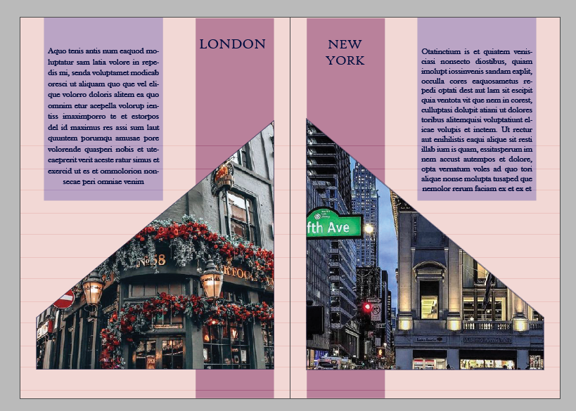
The two layouts that I worked on include a ‘Travel Magazine’ and a ‘Food Magazine’.
With the Travel Magazine I tried to include a good contrast of colours for the layout. I included eight cities and their descriptions (using the placeholder text). I made use of a very specific pattern for the arrangement of images using the frame tool. I made use of the master page in the positioning of the different elements on content page and the two different types of pages.


The Food Magazine included a lot of vibrant colours which highlighted the contents. I made use of geometric frames parallel to each other for fitting the pictures. The master page helped me in positioning the index and the two types of pages. I tried to place the text in a columnar format.


A glance through the various tools on illustrator helped us to understand their purpose and uses in a better way. We also learnt a number of new tools which were very useful in modifying the text in different ways. We were also taught to a give a shadow effect to the text using the Transform Tool. We also created our own pattern using swatches and later applying the same to the text.

These tools helped us in modifying the text and using it variety of other layouts. Creating the swatches and applying them correctly becomes important pertaining to the context of the layout. It also helps in placing the text in a better format.
