

30th March, 2020: Shruti Maliwar
The inner pages of a book reflect the theme and the kind of content which is depicted by it. It becomes important that these pages are designed in a way that they not only catch the reader’s attention but also make it visually appealing and meaningful. Besides the content, the minute details also play an important role in the layout of book.
Based on the type of content which goes into my book, I decided the layout of the book to be in such a way that it instantly gave an idea to the reader about the what the book tries to convey. The layout here was to simple and minimalistic. For this, I tried to keep the colour combination subtle but at the same time, it was derived from the overall theme of the book. I made use of double lined frameworks for placing the pictures and to provide a distinct background to it. For the text, I added a light background so that it was not only highlighted but also aligned to the rest of the layout.
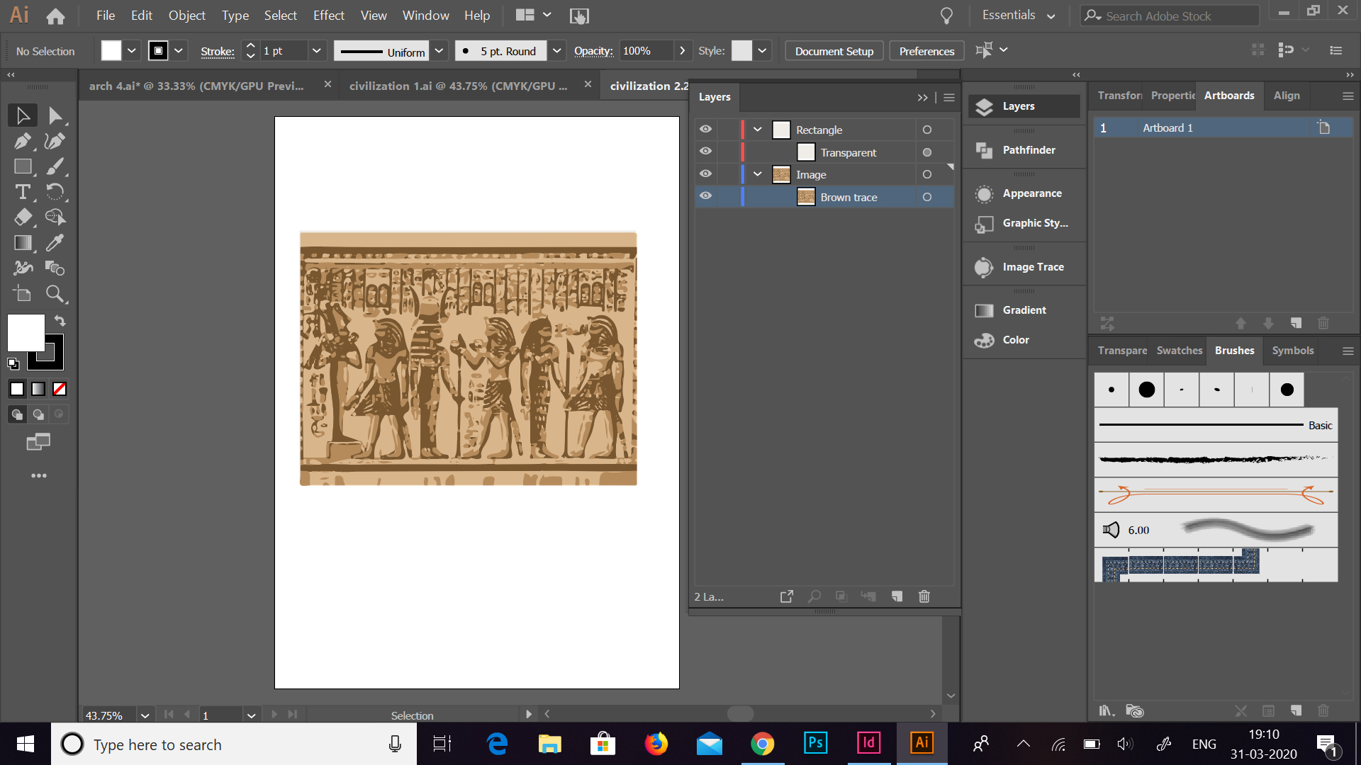
For the visual content, I made use of Illustrations in particular for all of them. This went with the theme of the rest of the book and also helped me to bring out only the important elements of that particular section for which it was used. The illustrations also provide a stylistic approach and indulge the reader even more. I tried to use colours which harmonized with the background and all of them had a similar pattern of shades and tones. For making these illustrations, I made use of the image trace tool, brush tool and the pen tool on Illustrator. It helped me in bringing out the accuracy of the same.
These are the illustrations which I used in the book:


Since I had four sections in my book for which the inner page had to be designed, I made use of two layouts which I repeated alternatively. This gave a cohesive appearance to the book and brought all the elements together.
The first layout which I made, is used in two sections of the book, namely, Civilizations and Clothing. It consists of the text on the top of the page, the title in the centre and the illustrations at the bottom. This enhanced the text and the illustrations individually.

Master Page 

The second layout goes for two section again, namely, Architecture and Sculpture. Here, I have tried to arrange the text on either the top or bottom with pictures placed accordingly. The title goes with the text in the box.

Master Page 

I made use of various paragraph styles for my body text, title, section pages and the picture captions. This helped me in identifying each of them individually and enhancing them.
A discussion on the same, helped me in understanding the layout of the book in a much deeper way. It helped me in developing my layout in a way that everything was aligned and properly placed so that the final book looked perfect.
