
2nd March, 2020: Shruti Maliwar
The reviews on the final prints of our booklets helped us in understanding the different aspects to keep mind while printing it. It also helped us to identify the different errors which we could avoid as we move ahead. The aspects such as colour, layout, text and image placement, had to be kept in mind and the proper combination of all these would create a fitting layout.
The following is the final test print of my book:


In this class, we were also introduced to the next project. This involved the making of a ‘Coffee Table Book’ which would be based on History.
Coffee table books are usually intended for casual reading. They contain a lot of pictorial content as compared to text. Since our books were based on history, it was necessary to capture the essence of the topic and bring it together in a proper manner.
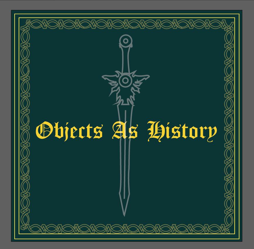
We started by designing our cover pages for the same. The colour chosen by me included a dark shade of turquoise which I used as the background. I made use of the Celtic design to create a border for the same using the Pen tool. Since it was the beginning of the process, I tried to visualize the placement of various aspects on the cover. I also planned on adding a jacket to the cover which would make it more effective.
I started with the cover by creating the basic layout for it:

The process helped me in understanding how the cover could be developed by adding various elements and placing them to summarize the entire book altogether. It also had to give the reader an understanding of it’s contents and therefore had to be very clear. All these aspects had to be kept in mind while designing the cover page.
