
23rd March, 2020: Shruti Maliwar
The movie ‘Helvetica’ revolves around the use of the typeface in graphic design and it’s importance. Helvetica is portrayed to be a clean and simple font which can be used to represent anything. It can be used in any form to depict a brand, a name, a quote, a location and so on. It is always in a readable format and people can easily recognize it. It is considered to be a timeless font which could be put to multiple uses.
This movie explains the importance of the use of typeface and how different people can have different opinions about it. A short discussion on the same, gave us a better understanding of it.
The bookmark made by me for my coffee table book was very much inspired by the cover. I tried to keep it as minimal as possible but with the important elements on it. The color scheme used by me was also similar to the cover.
The illustration that I chose for my bookmark consists of a combination of symbols of the Greek God Apollo and Ra, the Sun God from Egyptian Mythology. I also tried to depict the swords with this which is the main element from my timeline. I also made use of the Greek Architectural pattern which is emphasized on my cover. I made use of the pen tool to create my illustration and used the text tool from Indesign to add my title to it.
This was the final bookmark created by me:

Concept sketches for the book mark 
The layout with the illustration 
The Bookmark after adding text on Indesign 
The Layout after creating a space for the tassel 
The final book mark
After a discussion on the same, I considered putting a tassel on the bookmark as it would give it a better appearance and would go together with the entire illustration.
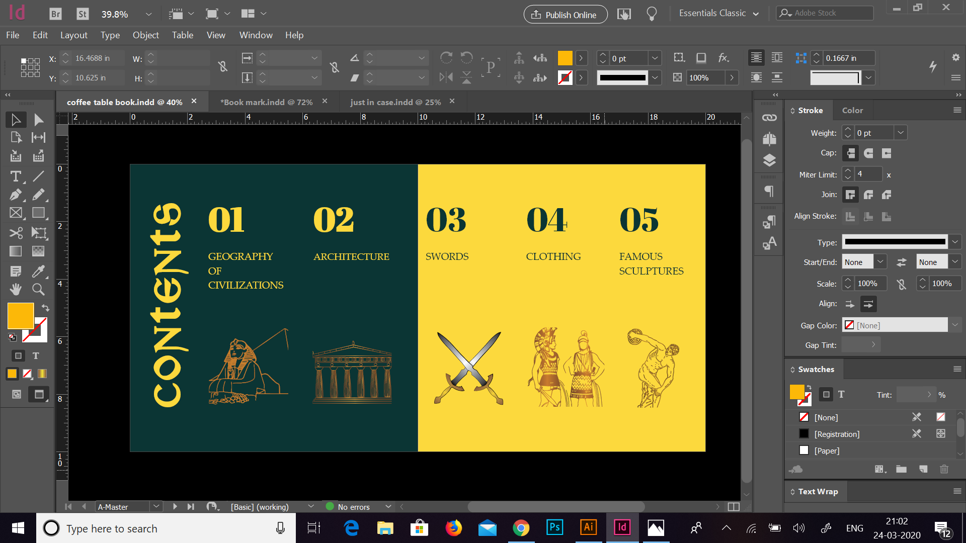
We also had a discussion on the contents page and the section pages. The contents page made by me was based on the different sections of the book and illustrations for the same. Initially, the idea of my content page was derived by using shades of the colours from the cover and I tried to represent it using placeholder images and texts.

Post discussion, I made modifications to this page by making it more minimalistic and adding colours which are similar to the cover as well as the section pages. I also tried to show the sections through illustrations which were made by me using the pen tool. I made sure that the text and illustrations went well together and the page looked cleaner and minimal.
This was the contents page after making the changes:


The section pages made by me consisted of the illustrations which I used for the contents page and the title of the section on it. I tried dividing the illustration by adding the name in the centre and giving a different look. Here, again I tried to keep the colours similar to the cover and therefore, created a flow of colours and similarity of pattern. The layout was the same for all the sections which made it more uniform. The initial idea of the layout was to create a colour difference in the text by placing it in the centre, but moving it one side not only shifted focus on it but also made it highlight of the page.


Through the book mark, I tried exploring the Gold Gradient which helped me in emphasizing the illustration and bringing out a good color combination. I put this gradient to use for the illustrations inside my book as well. Further, I also tried to play a bit with text and the colours. I learnt that by using fewer colours and repeating them in a certain way, we can create a good combination which also comes out well in terms of representing text and illustrations. The layout is something which also plays an important role for the placement of different elements in the book. The combination of all these aspects, creates a good book altogether.
