
24th Feb, 2020: Shruti Maliwar
The test prints for our booklets had to taken to see the appearance of the layout once it was printed. The important part was to get the pages aligned properly. There had to be no borders and everything had to fit to scale. Another important factor was the colour of the layout which had to be kept in mind as it would differ while printing.
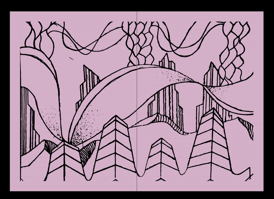
Some of the white borders in my test print had to be eliminated by giving it a well defined cutting. I also planned on adding two pages in the middle of the booklet which was distinct from the rest of the layout. This page would stand out and would also be a good separation for the different stories. I chose a lavender shade for this page and made it look a little contrasting to the rest of the booklet. I added one of my illustrations from studio on this page and eliminated the white background for the same.
This is the middle page added by me:

I also made some adjustments in the text by aligning them. And, removed the page numbers from the pages which had illustrations on them. I also made some changes in the text of content page. This is how it appeared :


For the cover page, I reduced the opacity for the background of my title which made it stand out and gave it a better appearance. It also blended with the illustration on my cover page.

All these changes helped me in improvising my new print which would be the final one. The test print also gave me an idea of how the layout was gonna appear once finalized.
