
9th March, 2020: Shruti Maliwar
The modifications made to my coffee table book cover helped me in understanding the placement of different aspects on the cover such as the title, illustrations, colour and so on. I also came up with the title for my book which is called : The Ancient Grandeur. And to highlight this on my cover, I chose to illustrate the architectural patterns from different civilizations which encircled the title. The illustrations being a part of the jacket and the title text being on the main cover.
This was the first draft of my cover:

Book Jacket 
Book Cover

Taking the test print helped me in understanding the various enhancements which could be made in the cover. Some of the elements like, the cut on jacket would be more impactful if it would have been cut into a square rather than a hexagon. I also tried to make some improvements in terms of the typography used for the title of the book. I tried to make it more effective for the depiction of the word ‘Grandeur’ and at the same time correlating it to the illustration around it. I made some changes in the illustration as well by making it more intricate and detailed in terms of architecture.
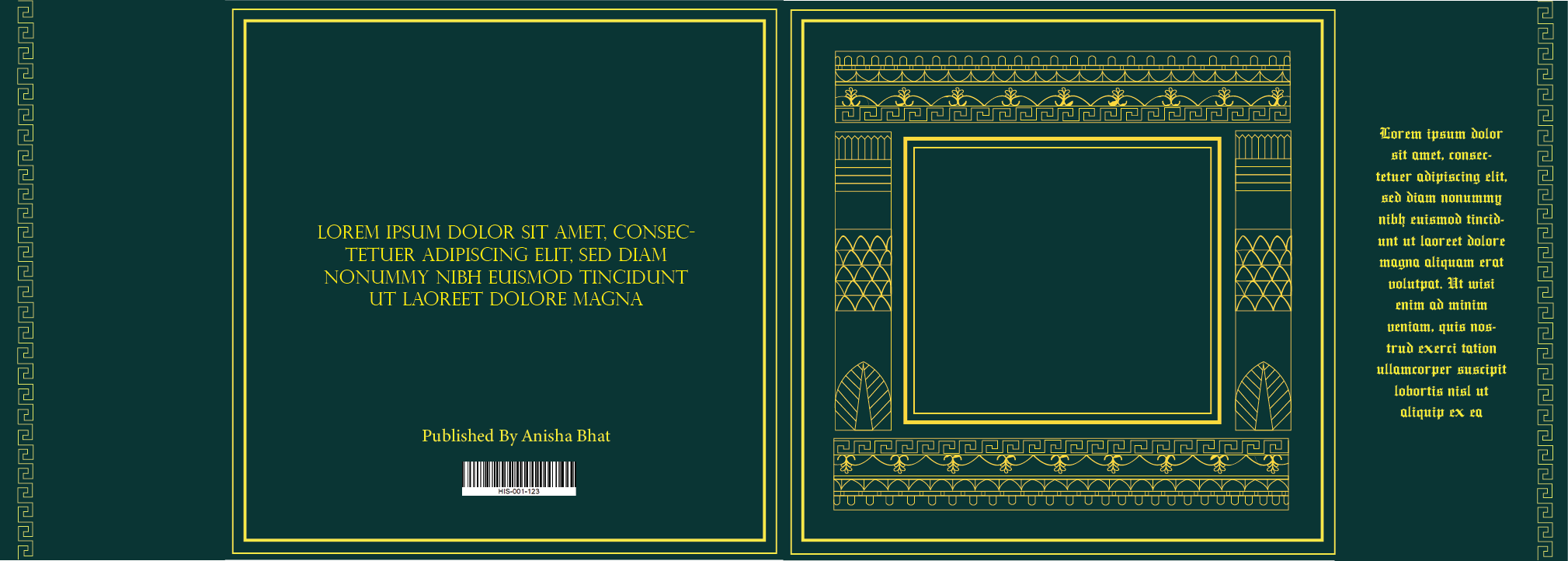
After making all of these changes, I compiled them together to create this cover:

Book Jacket 
Book cover

These changes helped me in placing the elements in a much better way. It also gave it a better appearance and made it look more cohesive. The detailing also increased the effectiveness of the cover. This process helped me in locating the different places where certain modifications would give a greater impact and therefore proved to be important. Elements such as colour and text played a vital role in this process as it is the first thing one would notice on a book cover.
